목차
[Summary] 30-Second Takeaway for Busy Marketers
- Diagnosis: High traffic but no sales? Your product detail page lacks a rigorous logic of persuasion.
- The Winning Formula: Structure your page in this order: Problem Awareness (Empathy) → Solution (Product Intro) → Social Proof (Reviews/Certificates).
- Design Layout: Control the visual hierarchy to guide the customer's eye, and always prioritize a Mobile-First environment.
- Efficient Production: Instead of spending hours removing backgrounds or struggling with messy templates, use AI tools to quickly build a "structure that sells."
Hello, this is Draph Art, solving e-commerce inefficiencies with AI technology.
We listen to and solve the worries of many sellers through our AI tools. The most common complaint we hear is this:
"I spent money on ads to bring people in, but why is everyone leaving without buying?"
It’s disheartening to work hard on a product detail page only to get zero reaction. What’s the problem? Price? Product? No. In most cases, it’s because the detail page failed to persuade the customer.
Today, moving beyond simple creation, we will share a marketing-focused strategy for creating product detail pages that significantly boost your Conversion Rate.

1. Creating a 'Logic of Persuasion' that Opens Wallets
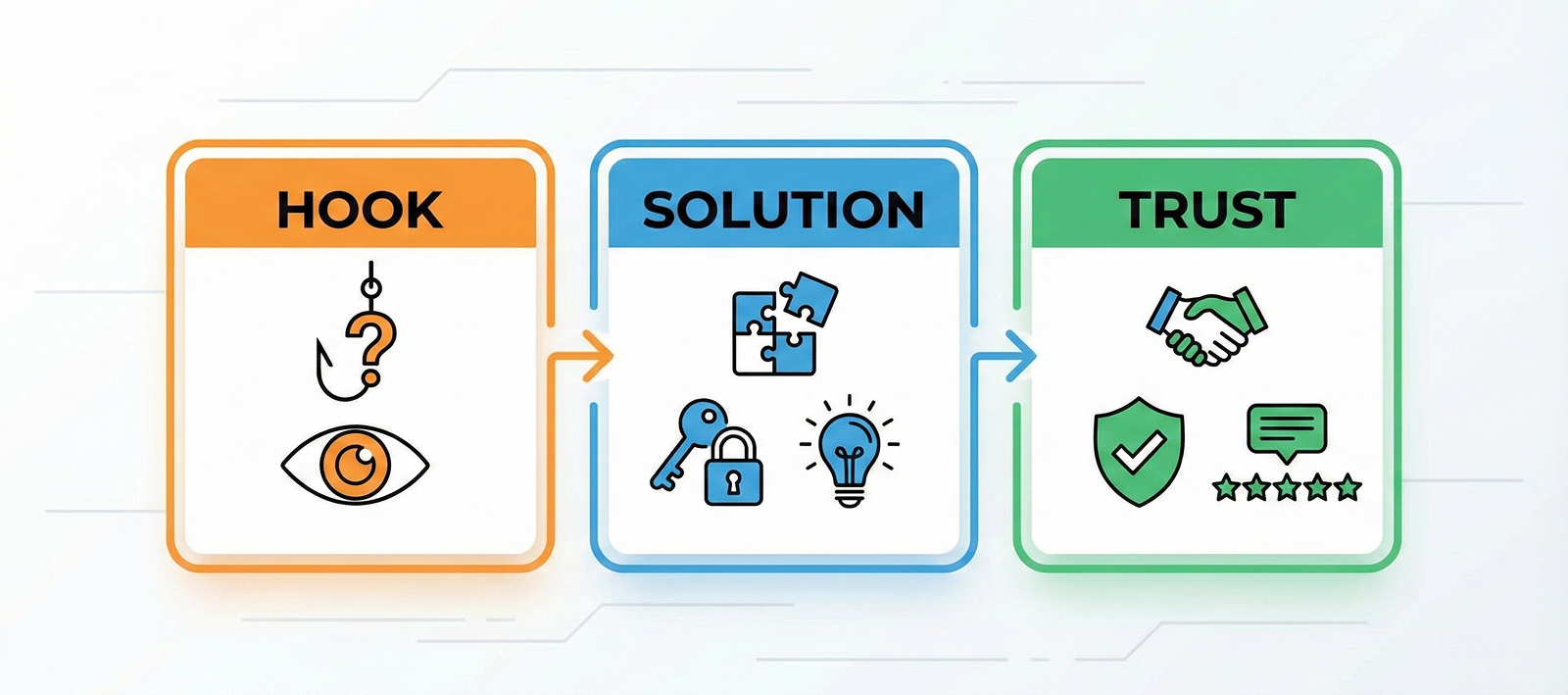
More important than a pretty design is a "logical flow." You need a plan where customers are naturally persuaded as they scroll down your page. High-revenue pages typically follow this 3-step structure.

STEP 1: Problem Awareness & Empathy (Hook) – "Wait, is this about me?"
The top of the page is the danger zone with the highest bounce rate. Don't push the product immediately. The key is to describe a specific situation or inconvenience the customer is facing to trigger "Emotional Empathy."
👉 Pro Tip: Start with a question. Make the customer answer, "Yes, that's me."
- Bad Example: "High-Density Memory Foam Pillow Released!" (So what?)
- Good Example: "Did you wake up with a stiff neck again today?" (That's my story!)


STEP 2: Solution – "Sell the Benefit, Not the Spec"
Show that "our product" is the only solution to the problem you just empathized with. The biggest mistake beginners make here is listing difficult "specs" from a supplier's perspective. Customers don't care about specs; they care about the benefit that spec gives them.
👉 Pro Tip: Use the "So What?" technique. Add "so it's good for the customer because..." after the spec.
- Spec: "Used 60-count high-density cotton."
- Benefit: "Because it's 60-count high-density cotton, it's soft enough for a baby's sensitive skin without any irritation."


STEP 3: Social Proof (Trust) – "Don't Just Take My Word For It"
Online shopping always comes with doubt. "Is this effective?" "Is it just good lighting?" You need to eliminate this final hesitation. The seller's words hold little weight here. Use the voice of a third party to prove your reliability.
👉 Pro Tip: Show concrete numbers and evidence. Specific "results" are more powerful than a vague "it's good."
- Reviews: Instead of simple star ratings, place specific photo reviews like "My neck pain disappeared after a week" at the top.
- Certificates: Instead of saying "Safe technology," show the actual patent certificate or a safety test report showing zero harmful substances.

2. Layout and Design Strategies to Stop the Scroll
Once the logical planning is ready, it's time for the Product Detail Page Design phase to make it easy to read. Even great content is useless if no one reads it.
The 3 Principles of Readability to Control Eye Flow
Customers don't read detail pages thoroughly; they scan them. You must make the important parts pop.
- Contrast: Make key messages huge and supplementary explanations small. Font size difference alone creates hierarchy.
- White Space: Don't pack text and photos tightly. Give enough space between paragraphs and around images so the eyes can rest. White space isn't just empty space; it's a "breathing pause" for the eyes.
- Highlight: Use your brand color to highlight key keywords or numbers. However, limit yourself to 1–2 point colors to avoid visual clutter.

The Real 'Mobile First' Strategy
Nowadays, 90% of shopping happens on mobile. You must discard the method of designing for a PC screen and forcing it to fit mobile. Start thinking with the smartphone screen in mind.
- Golden Size: We recommend a width of 860px, which is standard for many platforms. This size looks the most stable on most mobile devices.
- Font Size: Body text on mobile should be at least 28px~32px to be readable without squinting. If it looks "a bit too big" on your PC monitor, it's perfect for mobile.
- Loading Speed: If images are too long, loading slows down, and customers leave. It’s best to crop (split) images so the vertical height doesn't exceed 3000px per file. Compressing to JPG format to reduce file size is also essential.

3. I Get the Theory, But Execution is Hard?
"I understand the planning and the layout, but I'm not a designer."
Exactly. It's hard for marketers or solopreneurs to do all of this perfectly. You might rush to use a generic PPT template found online or waste hours just on Background Removal for product photos, leaving you no time for actual marketing.
That's why smart sellers are actively using Product Detail Page AI tools. They leave the repetitive, technical design work to AI and focus their human energy on the strategy of "how to sell."

4. Draph Art: Automatically Completing the Structure that Sells
Draph Art has implemented the "high-revenue detail page logic" described above into our AI technology.
(Note: The full automated detail page builder—including text generation and layout—is currently optimized for the Korean language service. However, global users can still leverage our powerful AI image generation to build visual assets for these structures!)
[Learn more about Draph Art AI features]
'High-Quality Image Generation' That Drives Clicks
Understood the theory but feel stuck staring at a blank screen? For marketers and business owners overwhelmed by planning, shooting, and designing, Draph Art has created a solution. The paradigm of detail page creation is changing. Stop worrying and let AI help you.

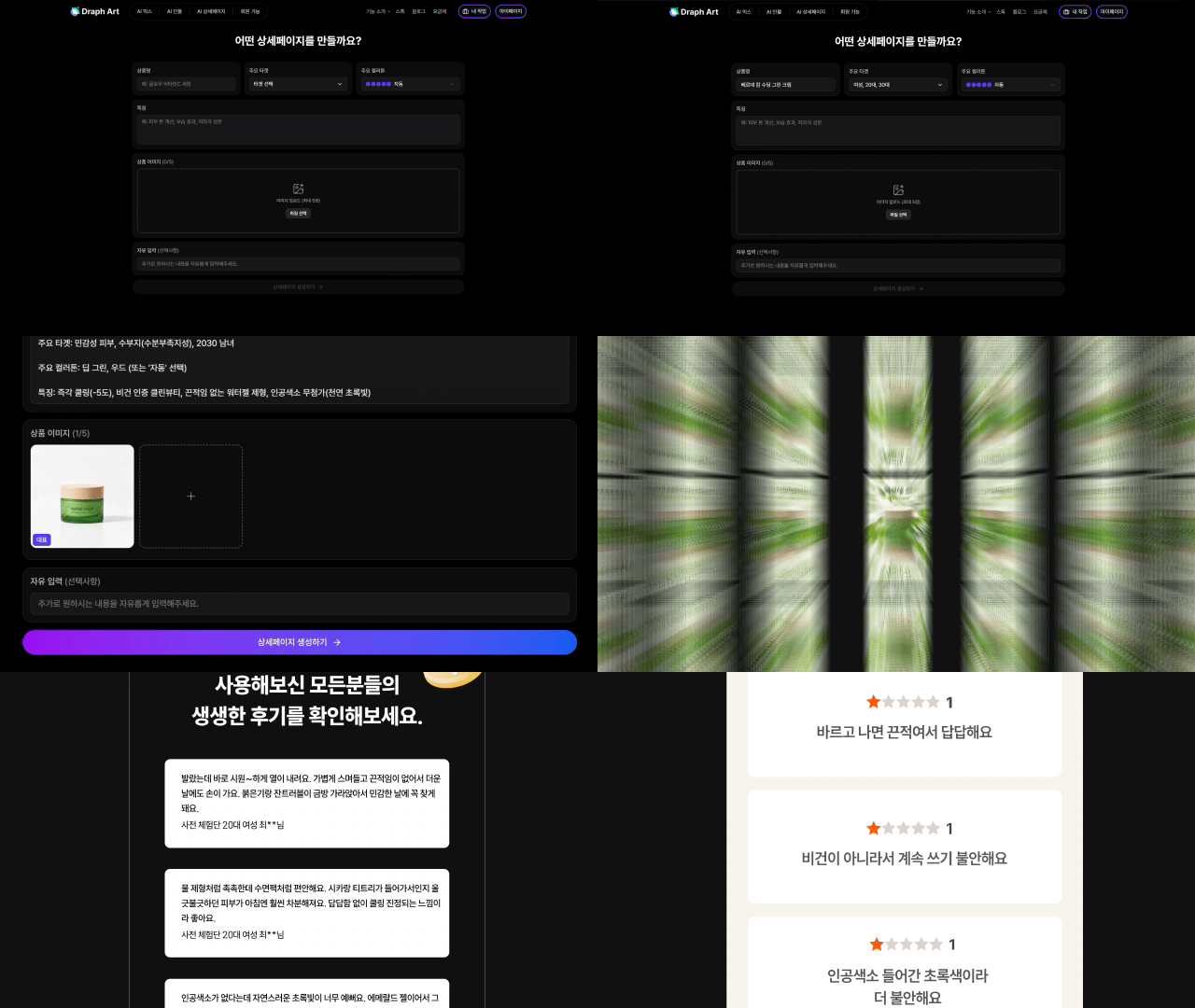
"Just Upload the Product" – From Planning to Design (Korean Service Feature)
For our users targeting the Korean market: You don't need to learn complex tools or hire expensive agencies. Just input your product photos and simple info into Draph Art. The AI analyzes the product category and automatically designs a "layout that sells." From persuasive copywriting to generating and placing high-quality images, it does it all "on its own." It's like having a veteran designer with 10 years of experience sitting right next to you.
"Change the Background" – Conversational Editing
Whether you are using our image generation or the full layout builder, modifying results is easy. You don't need to dig through Photoshop layers. Just talk to the AI like you're chatting. "Change the background to a more luxurious hotel bedroom." The AI understands your request in real-time and reflects it in the design. Draph Art is unique in offering such an easy, conversational interface for editing.

Focus on Marketing, Let Draph Art Handle the Production
The core of a high-converting product detail page isn't flashy design, but solid planning and strategic layout. Stop wasting precious time wrestling with design tools. Pour your energy into product strategy and marketing. Draph Art will handle the difficult and tedious work of visualizing those strategies most effectively. With Draph Art, creating a detail page that boosts revenue is no longer a difficult homework assignment.


.jpg&w=1920&q=75)
.jpg&w=1920&q=75)